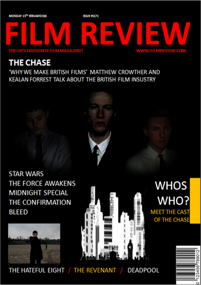
Like the poster I tried to change the image of the city to a British one but could not find one that looked as effective and so decided to stick with this image.
We conducted an interview with a small sample of five people, we showed them the front cover and then asked them their opinions on it, what they liked, what could be improved. Most people seemed to like it and though it looked very mysterious. The main criticism was that some of the writing could be changed to be more easily understood and so we changed this to make more sense. We have also kept the old city as we felt it suits the tone but we have also added some London landmarks infront.
There were also some complains about lighting however I believe that this is more to do with the device showing the magazine cover than the cover itself as it looks fine when printed and on most monitors.
There were also some complains about lighting however I believe that this is more to do with the device showing the magazine cover than the cover itself as it looks fine when printed and on most monitors.


No comments:
Post a Comment